6 Key Components for Building a Cohesive Brand
- Jul 25, 2018
- 2 min read
Recently at work I was tasked with helping to create a portfolio of logos and branding packages we could start offering to our hotel clients. For this I knew I needed to show just how far a brand would could to stretch to create a similar experience at every touchpoint. Hotels need everything from bedding to signage to uniforms and as you begin to work across all of these mediums you quickly begin to see the limitations in a company's identity. This applies across all industries as the internet and the real world require different needs and usages for a brand. I have found that there are six key things that lend a brand identity to have the flexibility it needs while still maintaining a cohesive message:
Color
Typography
Logo Variations
Patterns & Textures
Image & Graphic Styles
Tone of Voice
Color
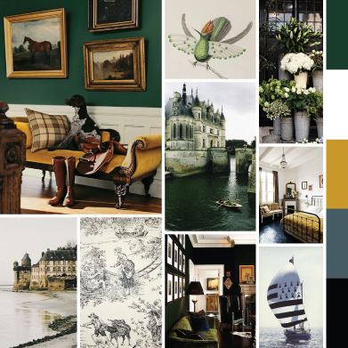
Color, and the psychology behind it, plays a huge role in logo and branding design. It is the first thing to set the tone for what’s to come and can become a key factor for recognition. I mean, who hasn’t heard of Tiffany Blue? Color is the first way to connect with your audience, bright colors say something very different than an all black and white design, and it is important to consider who you are ultimately trying to appeal to. Darker blue is seen as professional and trust-worthy while orange and yellow are playful and energetic.
Color palettes can include anywhere from 2 to 6 colors and there is no real answer for the exact number a brand should have. The one thing that I think is the most important to include in any color palette is at least one light and one dark neutral color. These quickly become the work-horse for your brand as they provide the backdrop for your highlight colors to shine. Even if your brand colors are fairly neutral, you will find that a nice dark gray or a white will always help you out to ensure the design stays balanced.

Typography

Comments